Automating UX design process using Pixelic
Pixelic is a design-first product collaboration software that integrates with Figma/Slack. We help designers to better manage feedback/tasks, documentation, and search/filter Figma frames quickly.

A few weeks ago, our team adopted a tool called Pixelic, a UX collaboration tool that integrates with Figma and Slack to make design feedback, task management, and documentation more accessible.
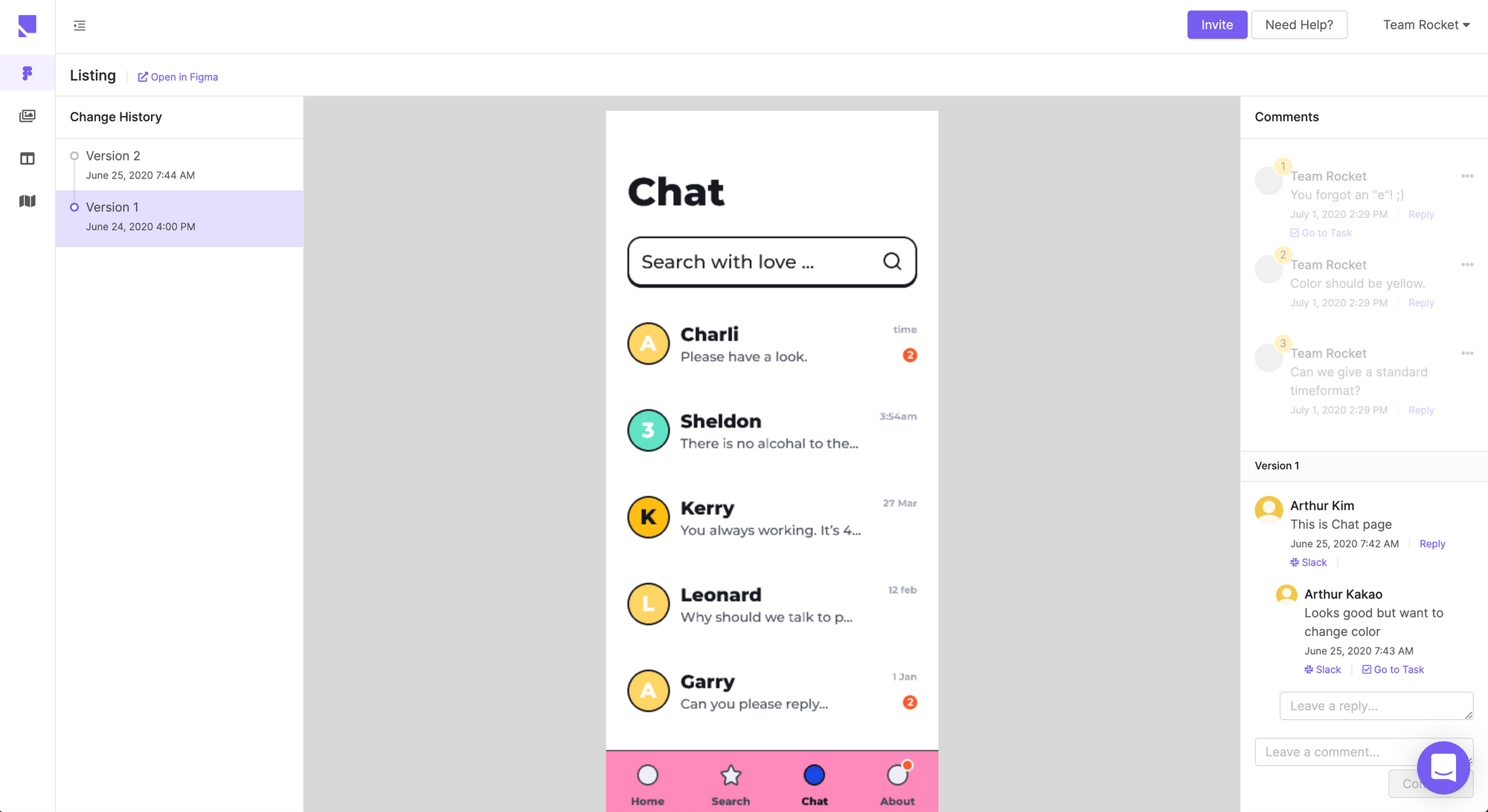
I observed our team go through multiple design iterations using the tool and thought it’d be helpful for other designers and teams to get a perspective on how Pixelic makes the UX design process much easier.
Here are three topics that I’ll be sharing:
- When do you use Pixelic? A use case for teams
- Tracking history and product backlog through Pixelic
- Creating a shared understanding via Pixelic and its efficacy
When do you use Pixelic?
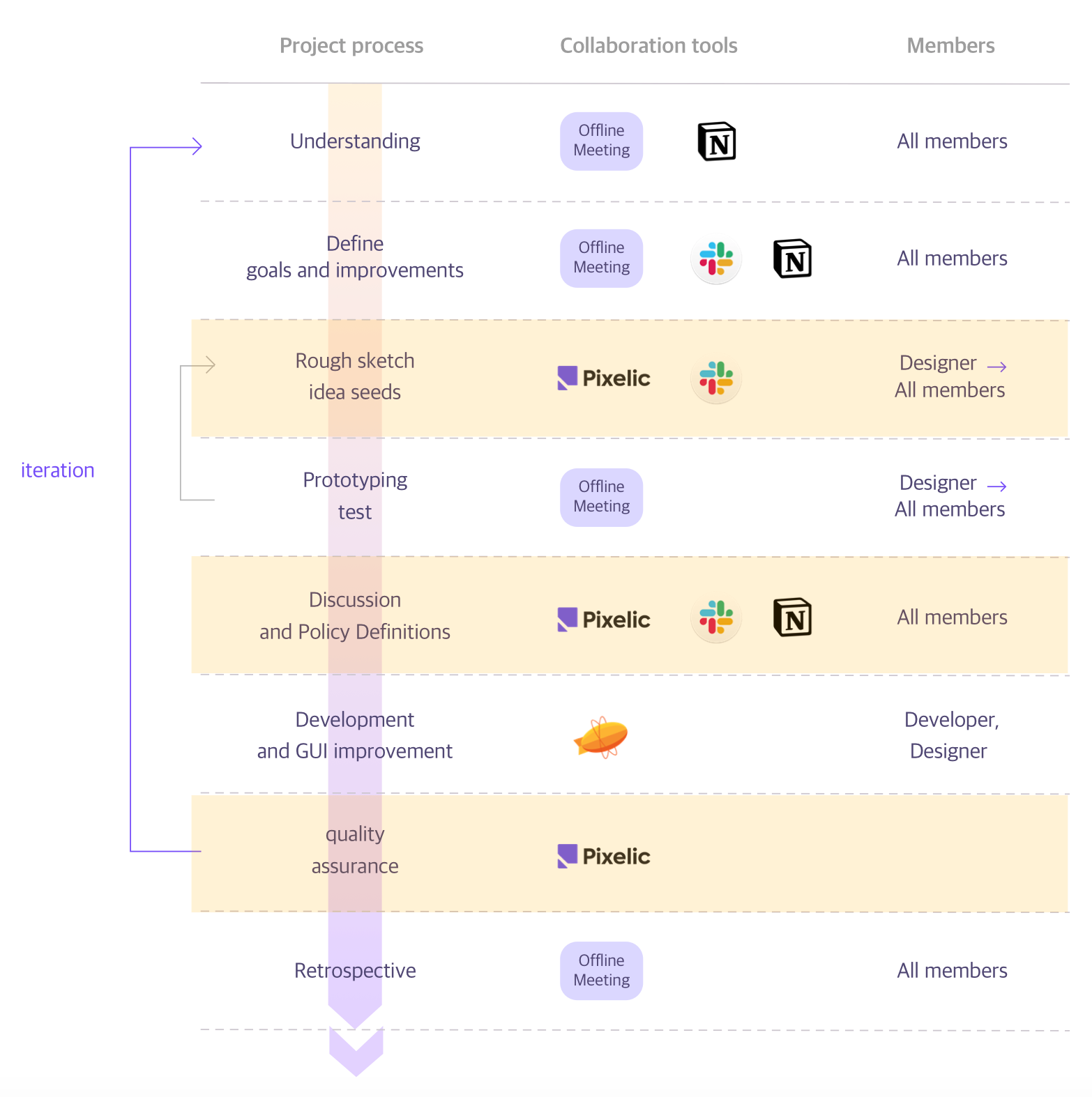
Rows colored in yellow (from rough sketch, discussion/UX policies, to design QA) were design phases where Pixelic made our collaboration easier.
Improvement Points
Pixelic launched its first open beta in May 2020, so there were areas for improvement and a few features still in development.
We needed a wiki-like feature where we could take notes, store UX specifications, and share them with product and engineering teams. Notion and Zeplin were our go-to-tools for this during the “Understanding” phase in our design process.
It was pretty difficult to switch from Notion/Zeplin right away, but we hope to see more improvements in Pixelic’s documentation features.
Where Pixelic came in handy for our team
We realized that Pixelic could be a source of truth for the communication log as it integrates with Figma and Slack. This came in handy during our Design QA phase.
Before Pixelic, we had to manually create QA documents in Notion and share it with our engineering and product partners. We would copy and paste several links, upload screenshots, write thorough descriptions on the acceptance criteria.
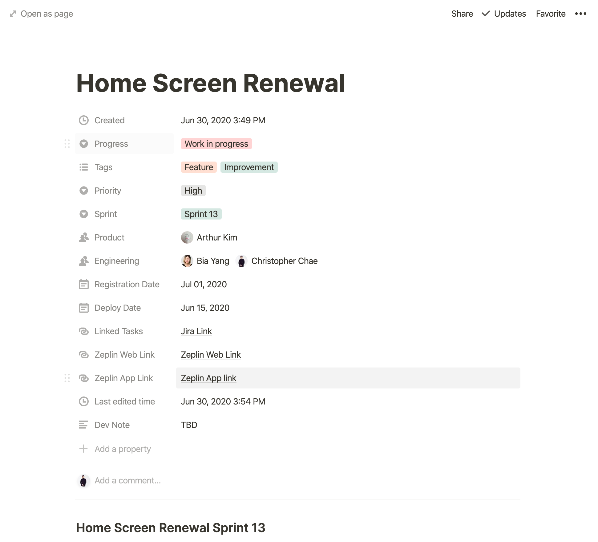
With Pixelic, we’re now able to just import Figma frames into the tool and write acceptance criteria using Pixelic’s annotation feature. There’s no need for us to take screenshots, copy/paste Zeplin links, and communicate with our engineering partners to create QA tasks. Pixelic did them all automatically.
1) Tracking design task backlog history
Not having an optimal product development and design process often made our workflow less productive. It looked something like this:
- Designer “A” and Developer “B” review design and exchange feedback in Slack
- They then add the outcome (often design tasks) of the meeting to a Jira project Kanban board under the backlog
- Product manager “C” notices the new task, but doesn’t have any context as to why it was created. So “C” requests designers “A” & “B” to explain.
- Teammates “A” & “B” stop what they were doing, and loop C in so “C” could understand the context
If only we had a place where the product manager (“C”) can read/understand the context behind a task or decision without asking the designers “A” and “B,” they would have kept their focus on doing more important tasks. We became less productive as a team due to redundant meetings and discussion. (Meetings are seldom productive!)
We found that Pixelic was a perfect tool for this pain point. Here are a few ways Pixelic helped us:
2) Pixelic automates task creation process
It’s pretty difficult to keeping track of action items during design reviews. Someone has to take charge of translating discussions into actionable tasks and adding them to a project board while others continue discussing.
But with Pixelic, all you need to do is click the “taskify” button on each comment. Even during meetings, you can convert comments into tasks while viewing the design, so there’s no “context-switching cost” incurred. Pixelic lets you convert comments into tasks without diverging from the discussion.
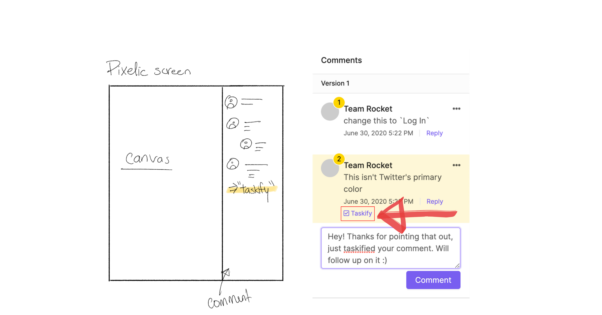
Traditionally, teams switch between communication apps (e.g., Slack) and task management apps (e.g., Jira, Notion, etc.) to go back and forth, discussing and adding tasks. Pixelic converges them together so that you can instantly flip the switch to “taskify” a comment.

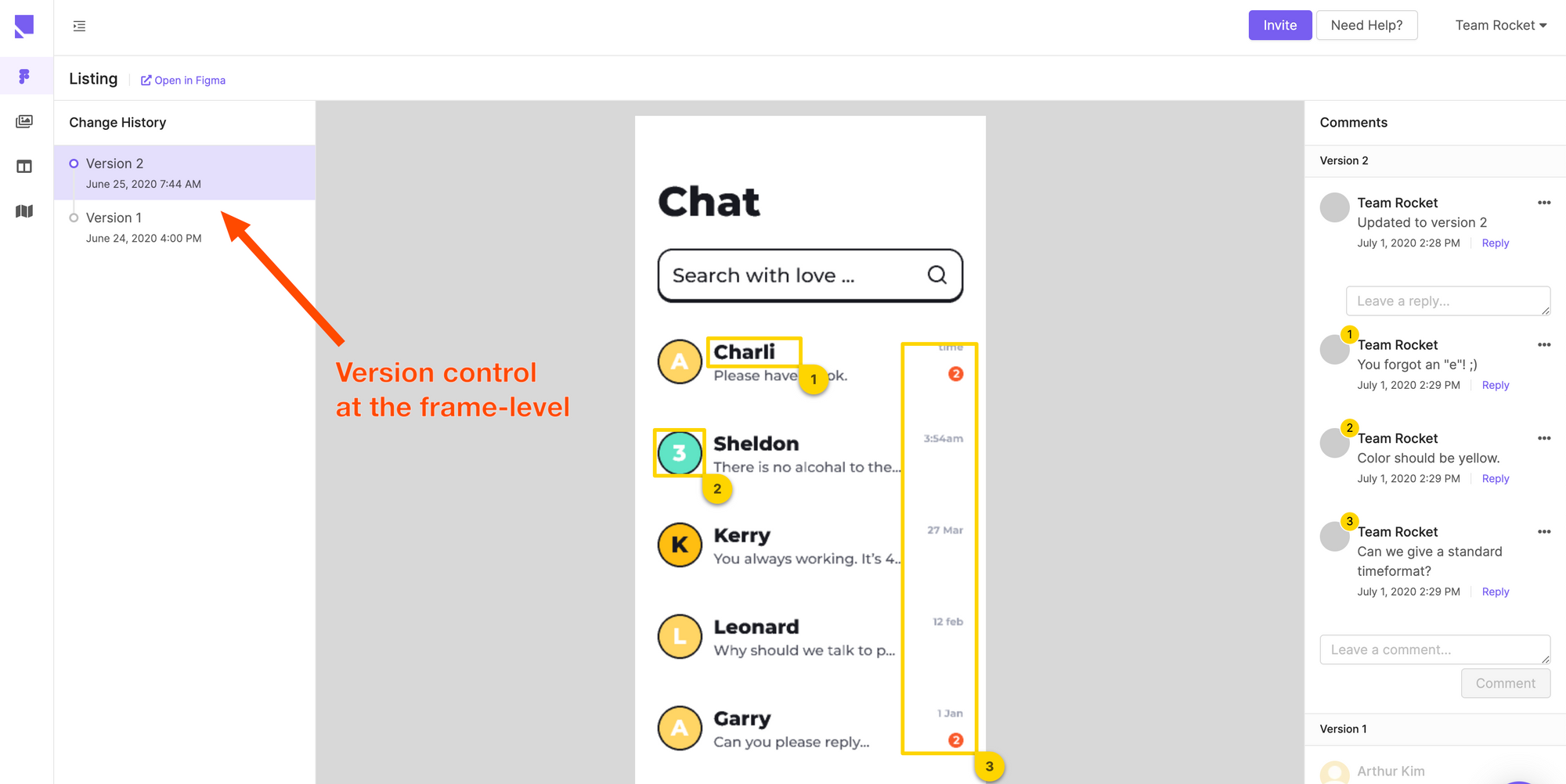
Pixelic also has built-in version control for each Figma frame. With this feature, you can track all comments by each version.
3) Pixelic tasks connect with Figma frames and their comments “2-ways”
Pixelic’s unique task management feature allows designers to access Figma frames directly from the tasks. This is different from what you see in Notion or Jira, Pixelic’s Figma integration imports actual Figma frames into the tool for you.
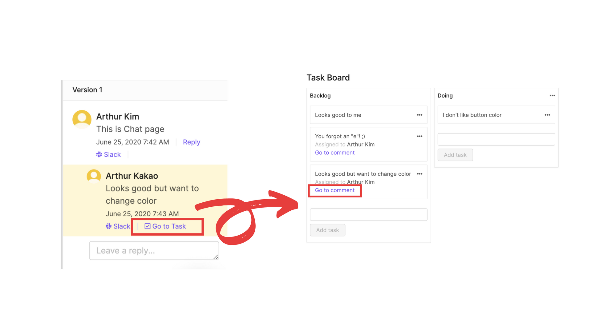
This has two key benefits: (1) anyone can understand the context behind the task without asking others, and (2) view relevant Figma frames, or user flows without logging into Figma.
Engineers and product managers can access relevant UIs connected to each task and quickly understand the task.
Adding links, screenshots, and descriptions to each task on Jira or Asana is cumbersome if you have to do them every time. In Pixelic, since Figma frames are connected to each task, there’s no need to copy/paste links or screenshots.
Driving a shared understanding of the product through interface
Let’s say your colleague suggested above during a product meeting. How many of your team would think of the same screen? Was it the landing page? Sign up page? Main application page?
Without a shared understanding of the product, it’s challenging to communicate, and often people would have to elaborate with more details.
It’s too hard for people to see the forest through the trees, so to speak. Without the interface, people will think of different representations of the product. It’s just not an effective way to collaborate.
Driving shared understanding is crucial to make your workflow productive. Too often, teams revert back to ideation because they failed to align on the same page.
From my experience working at various startups as a product designer, what worked was communicating visually.
Visual communication saves not only the presenter’s time but also the audience because they can see what you’re seeing. Experts say a human brain processes images 60,000 times faster than texts.
Pixelic is the ultimate visual communication software
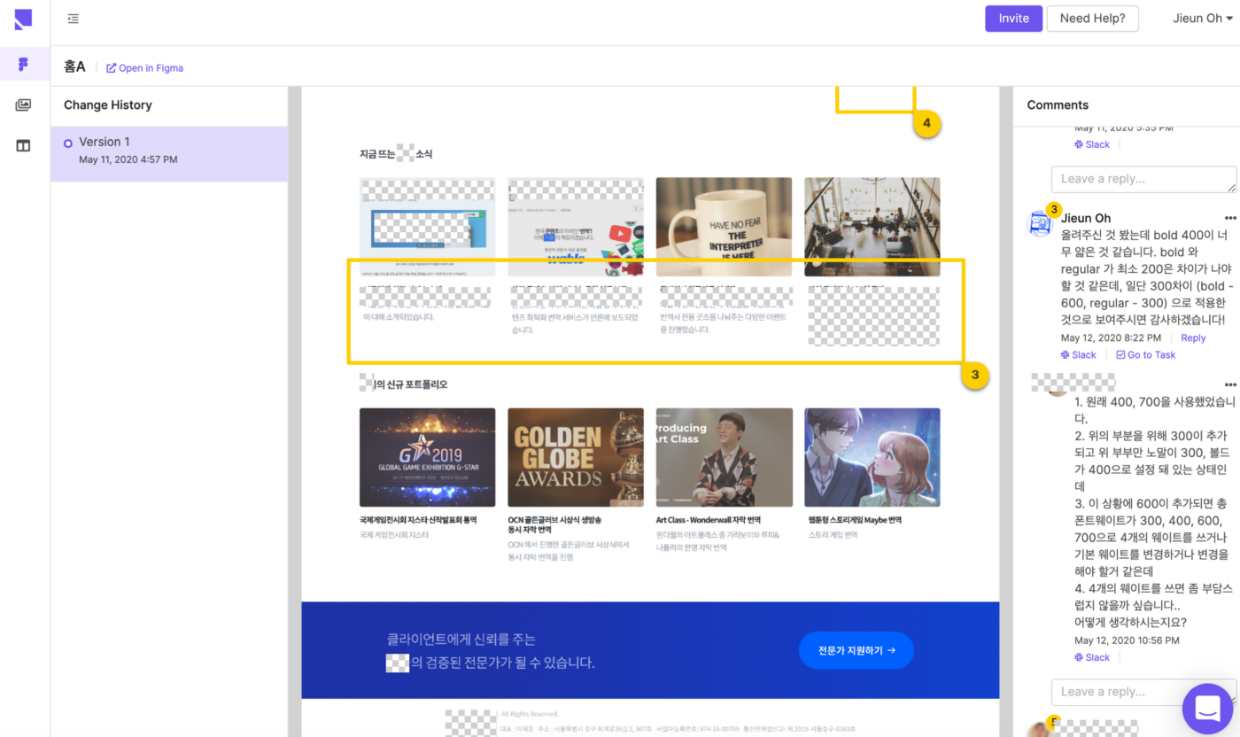
In offline meetings, you can point out where you are talking about with your fingertips, but in remote settings, it’s not that simple. And remote collaboration via video conferencing now became the norm since COVID-19.
Pixelic helped us see the visuals (interface) as well as comments next to them while video conferencing. In Pixelic, you can click & drag specific areas of the image and comment on them. This helped us to store everything so we could always go back to them later.
In Conclusion
Yes, adding a tool to your already tool stack isn’t the most exciting thing for your team. But if the new tool replaces or complements your current stack to enhance team productivity, it’s a no brainer to adopt it.
Pixelic was a no brainer for us. Through Pixelic, we were able to enhance our team productivity. It helped us build a clear, shared understanding of our product across the team. And managing design projects were super easy and convenient thanks to its seamless integration with Figma.
There are some features that Pixelic still needs to add to replace our entire design collaboration tool stack, but ever since we started using Pixelic, its founders moved fast to add new fixes and updates every week.
The founders have been super supportive of any questions or requests we had. We’re excited to partner with the Pixelic team to build an optimal tool for software teams.
Jieun is a product designer based in Seoul, South Korea. She worked as a product designer in companies including Mathflat and Wable. She’s an avid writer! Check out her posts on Medium. You can also reach out to Jieun via her email address: ohjieun8018@gmail.com.
Pixelic is a UX-first collaboration platform for designers and product teams. It works with Figma frames, and designers can create tasks, feedback loops, and UX specs using the imported Figma frames.


